Monday, 8 December 2014

Context Of Practice 2: Contextual Reference

The project question I have defined concerns with an efficient artistic practice.
Initially, it seemed obvious to refer to artists who worked primarily with recycled materials.
Gerhard Mayer splices together old jigsaw sets into vast collages, which is an excellent example of appropriation. Having seen them in person, I can contest that they are highly considered and well crafted designs.

In addition I looked at the work of various practitioners whose work would lend itself to collage. In particular I considered the work of 'HR FM', who specialises in the use of highly detailed vector artwork. Through my own responses I hope to apply a highly detailed aesthetic in order to use materials and tools efficiently rather than wasting them on dry minimal designs.

Context of Practice 2: Study Task 1 Practical

Through the duration of this project I wish to improve how I use sketchbook space, as I have found that I am somewhat wasteful in my illustrative practise. I would suggest that it would be a poor reflection on my practice if I criticise wasteful design through my work, whilst doing nothing to improve my efficiency.


The obvious way to address wasteful design is to make each page visually dense, so rather than producing large quantities of uninvolved drawings, I would instead use the all of the free space available.


I have found the book 'Made the Break' highly useful to fuel my initial research. The book summarised the growth of the culture of obsolescence. 
(SLADE, GIles, 2006, ‘Made to Break’, Cambridge, Massachusetts, Harvard University Press)

The book explains the three distinct forms of obsolescence:

Technological Obsolescence
The normal improvement of technology causes the replacement of hardware / software

Psychological/Progressive/Dynamic Obsolescence
Consumers purchase newer products as they are marketed as 'new'. They are pressured to buy the products in order to conform

Planned Obsolescence
Manufacturers create products with deliberately short life-spans, to increase the rate at which consumers buy replacements

The book also has a great amount of quotes from industry leaders who initially pioneered the concept of planned obsolescence to ensure profit. I found it interesting that these figures rationalised the obviously wasteful practice as a tool to ensure continual economic stability. 

'Our whole economy is based on planned obsolescence, and everybody who can read without moving their lips should know it by now. We make good products, we induce people to buy them, and then next year we deliberately introduce something that will make these products old fashioned, out of date. We do that for the soundest reason: to make money!'

PRENTIS, Karl 1958, 'Brooks Stevens: He Has Designs on Your Dough,' True: The Man's Magazine 1958

Context of Practice 2: Research Proposal


Monday, 10 November 2014

Context of Practice 2: A Trip to the Museum

In order to encourage a practice of primary research we were given specific places in the city to study. Our group visited the Leeds Art Gallery and made a variety of studies on tracing paper.

Upon our return to the studio we began to assemble the imagery on a light box.

Having found the space limiting we expanded to the window.


Although the final composition seems to lack a logical structure, it was created with the consideration of the contexts of each image; the
landscape painting studies appear at the top, while figure-based studies appear in the implicit foreground.

Identify unexpected/useful outcomes of (a) combing your drawings with other group members and (b) having a focused task to achieve in a short time

a) By combining our work we managed to create a sort of holistic study, encompassing the many distinctive view points and aesthetics of each individual. The response we created was more diverse than what any one person was capable of.

b)The short time limit provoked us to allocate tasks to each other, and use the space of the museum more effectively, we deliberately split up in order to gather a varied amount of information.

Comment on how Task 2 led you to respond to the gallery/museum. If this was different to previous visits, how and why?

I found the task different to other such research tasks as it wasn't provoked by initial contextual research, in addition I found that I was more sceptical of the art work when considering it's compositional and aesthetic elements.

How could the practical aspect of COP 2 be extended to challenge your image-making further and enhance your essay line of enquiry?

I shall consider visiting more locations, even if they aren't obviously associated with the themes of my inquiry. Using a small selection of dry media seemed to enable quicker responses, meaning I could create a larger quantity of reference material for later developments.


Tuesday, 4 November 2014

Context of Practice 2: A Trip to the Dump

To provoke some visual responses, I visited two local recycling and waste sites.
The first, Ellar Ghyll is the community waste cite of Otley. Here locals bring their various wastes and deposit them in the relevant large container, which is taken to landfill or another recycling facility.


The second, Crossley Evans Scrap Yard is a much larger site. A mountian of scrap material is observable to all who cross the main bridge in Shipley.


I would suggest that referring to a local location within the essay would be somewhat beneficial, using primary research can produce new lines of enquiry and totally original arguments.

Friday, 24 October 2014

Context of Practice 2: Study Task 3

Le murmure du désert grondait à l’infini.
C’est ici que se perdent les nuages. 
The following discussion shall cite Pierre's illustration as an example of digital distribution in order to summarise Walter Benjamin's essay 'The Work of Art in the Age of Mechanical Reproduction' (Benjamin, W, 1936). The essay establishes the notion that 'aura;' being the intangible appeal of art.
According to Benjamin, aura 'withers in the age of reproduction'. He goes on to say 'By making many reproductions it substitutes a plurality of copies for a unique existence,'by which he means that the sense of authenticity inherent in individual artworks is saturated by their reproduction. Pierre's illustration has been created almost entirely digitally, meaning that there is no original artwork. In addition, the image has been optimised for digital distribution; it is in .gif format. The imagery has not been considered for print distribution, thus the only interaction an audience has with the piece is through screen-based media. 
Pierre's .gif is indeed 'designed for reproducibility;' it costs nothing for the viewer to simply copy or bookmark the .gif and view it at their leisure in almost any context. Benjamin suggests that this is a positive aspect of reproduced artwork; 'in permitting the reproduction to meet the beholder or listener in his own particular situation, it reactivates the object reproduced,' meaning that the artwork remains personal and fresh to the beholder in whatever context it is viewed in, rather than becoming stale or aged in a gallery format.

Obviously, Benjamin did not predict how screen-based media would eliminate the ageing effects of artwork, as he suggests;  'Even the most perfect reproduction of a work of art is lacking in one element: its presence in time and space, its unique existence at the place where it happens to be.' Artwork that exists on screen is not subject to the ravages of time, while  arguably the screen itself may become outdated and replaced, the art itself goes unchanged.

However it may be noted there is an elitist quality to work existing in a digital environment; it presumes the viewer has access to such equipment, although arguably the vast majority of Pierre's audience exists in the digital environment. To initially view the .gif one must also have a reasonable internet connection which is an additional obstacle to it's viewing. 

Thursday, 23 October 2014

Context of Practice 2: Study Task 2


War is Nothing More


The title of the collage 'War is Nothing More' refers to the concise quote 'war is the continuation of politics by other means' as defined by Carl von Clausewitz in his book 'Vom Krieg' (On War). In relation to the image, the artist is insinuating that contemporary wars are an extension of political motivations, rather than moralistic campaigns.
This discussion shall establish whether the aforementioned collage created by Thomas Dellart-Delacroix may be considered as an example of valuable illustration, using supporting references.

Paul Schutzer, the renowned Life magazine photographer captured the original image of a VietCong prisoner who had been bound and gagged by American soldiers. Contextually Dellart-Delacroix's image was created during the Iraq War, which was subject to mass criticism and protest.
The artist is suggesting that the American foreign policy has changed little over the decades, where once communism was a valid excuse for conflict, now the vague evidence of weapons of mass destruction are now cause for war. In addition the design makes the allegation that war is not simply an extension of political motivation, but also commercial.  This supports the view that 'consumerism is running uncontested', and that this work is indeed challenging consumerism 'through the visual languages and resources of design,' (Lasn, K. et al, 2000), thus reinforcing the value of piece.

Further, the collage draws attention to typical products associated with consumer selling, we may observe imagery of tomato sauces, cigarettes and fizzy drinks. This is akin to the listing of products of the original First Things First manifesto which gives examples such as 'slimming diets, fattening diets, deodorants, fizzy water, cigarettes, roll-ons, pull-ons and slip-ons' (Garland, K. ,1964).  The piece is indeed  'a reversal of priorities in favour of the more useful and more lasting forms of communication' (Garland, K. ,1964) as rather than contributing to the system of commerce it instead chooses to satirise it and it's relation to modern conflicts.

Through the use of subversive collage the piece illustrates what the artist has decided is an unhealthy synthesis between business and foreign policy. By appropriating familiar brands as the gag of the victim, the artist may be suggesting that the images crafted by graphic designers are in fact 'helping draft a reductive and immeasurably harmful code of public discourse' (Lasn, K. et al, 2000)

To summarise, the piece may be viewed as valuable design which challenges the relentless onslaught of commercialism. Rather than aiding it's message it contends it, further it seems to have a lasting effect, it equally relevant now as it was during the Iraq conflict, and it shall continue to provoke viewers to question their countries own role in global conflicts.


Thursday, 16 October 2014

Context of Practice 2: Study Task 1

War is Nothing More


'We have reached a saturation point at which the high pitched scream of consumer selling is no more than sheer noise'

There's Nothing to Do on Mars


Take field trips 
'The bandwidth of the world is greater than that of your TV set or the internet or even a totally immersive interactive dynamically rendered, object-orientated, real-time, computer graphic simulated environment.'


Thursday, 8 May 2014

Context of Practice: Module Evaluation

Throughout the brief I had endeavoured to improve my investigation of research and the thereafter visual responses. This has involved a broader selection of appropriate texts, which have directly informed the decision making during visual development. I have also greatly improved my capacity to use a sources form a variety of media, rather than solely relying on the the internet for limited and often vague information.

In terms of image making I have continued to pursue the use of screen printing, though this proved quite stressful and error-laden I eventually produced a series of good quality prints and introduced myself to the use of vacuum beds. This process has definitely contributed the overall visual quality of the final pieces, that perhaps would not have been instilled if they were produced digitally. My application of varied line has boosted in confidence due to the fastidious studies I conducted of reference material. Though I did not eventually make use of loose ink application in the final pieces, I did investigate it frequently in earlier visual responses, which I think has been beneficial to my overall understanding of tone and lighting. By using the light-box I have been able to selectively refine my drawings repeatedly, which resolved the initial problems I experienced with accurately portraying the faces of each Bond actor.

I rather find that the final resolutions are quite strong pieces and have benefited from an expansive amount of thumb-nailing and repeated investigations of format and composition. The quality of the final prints are due to a arduous repetitive struggle with the screen printing process, thankfully the sheer amount of problems that occurred throughout did not have too much of an effect on the final pieces.
I have shown a dramatic change in the use of fine liners and other assorted pens, the early drawings in my sketchbook are quite different from the final pieces, this is due to a considerable improvement of confidence which has allowed me to draw quicker and with no digital aid. In addition I used a large amount of reference books which allowed me to produce dense areas of detail within the compositions.

In terms of the less successful; many of my prints present poor registration this would have been resolved with a more appropriately sized silk screen, as the A1 screen proved somewhat noncompliant.
My own inexperience with large screens also produced multiple printing errors, notably the odd void of tone on Roger Moore's face is a result of not cleaning the screens sufficiently. I would also add that I am disappointed in not making more of an effort to faithfully reproduce the hair texture of each Bond, as within each composition, this is the most notable deficiency.

Upon the chance to repeat the project I would investigate perhaps creating a single image with multiple colours, rather than the black and blue combination, as this is a palette I have used for several projects and seems to be getting repetitive. I would also liked to have printed the posters on a larger scale, as the downsizing of my original drawings resulted in prints which were about half-scale.


Context of Practice: Studio Brief 2 (Final Review)


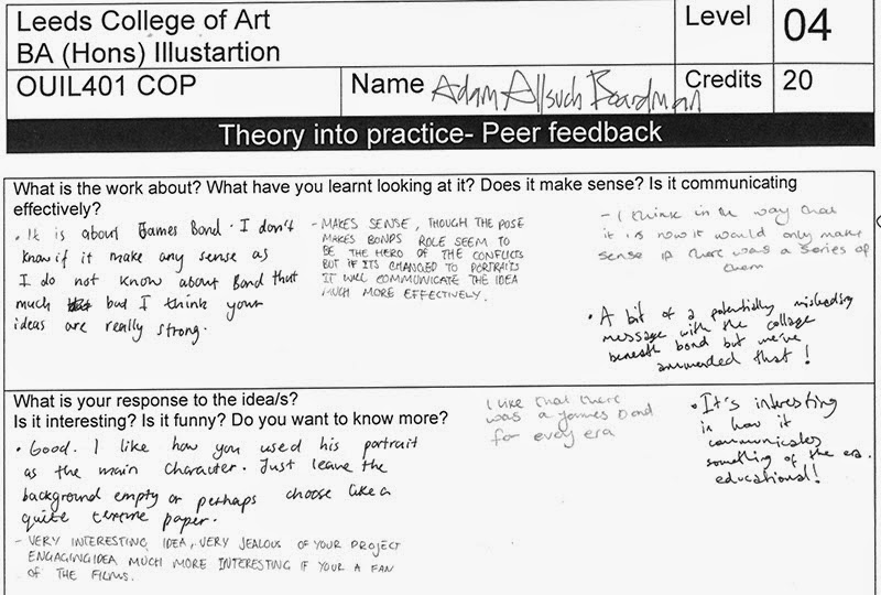
In this review session we left anonymous feedback in regards to both positive and negative attributes of the final resolved pieces. I rather think the group as a whole produced some really high quality illustration, and this sentiment appeared to inform a lot of constructive feedback.

I am quite pleased with the resolution of my work, and this has been mirrored by the largely complimentary peer reviews, however some comments have pointed out several less successful elements within each composition that I had not considered.


Context of Practice: Studio Brief 2 (Final Screenprints)


After the advice of the print room technicians I separated the three tonal images onto one A1 screen, and the line art onto another.
Using two A1 silk screens was a largely inconvenient in terms of mobility, and it forced me into using the vacuum beds for the first time. The initial attempts at printing were largely flawed and quite poor quality. However over the course of a day in the print room I eventually managed to produce about 20 prints of a pleasing quality.

I also conducted two other colour tests, however after the feedback of several peers, it seemed more appropriate to unify the colour scheme of each poster to a blue tone.

Friday, 2 May 2014

Context of Practice: Studio Brief 2 (Colour Test)

I have added a second layer of colouration, to test the potential in screen printing. I have opted for the colours most evident in Cold War thriller posters. In addition I layered a select amount of newspaper articles from each of the eras to give each composition a little more detail.


Thursday, 1 May 2014

Context of Practice: Studio Brief 2 (Completed Line work)

By consulting with numerous photographic annuals in the library I added heaps of historical references to the Bond imagery, I chose a wide range of images, each representing a significant event or progression. For example, the Connery piece contains a several nods to the space race.


I decided to broaden Moore's era to the 80s, as this seemed logical due to his long legacy.
I hope to screen print these images with some suitable colouration, though I may have to sacrifice some amount of scale, as the current images are larger than A3, which is rather a complication.

Friday, 25 April 2014

Context of Practice: Studio Brief 2 (Final Peer Review)

Similarly to the previous crits we grouped rather randomly to avoid familiar faces.
In reflection I found this crit really helpful, perhaps the most successful crit of the whole year. As a group we explored each others qualms and strengths and made decent suggestions.

The group unanimously supported the idea of making a series of posters rather than a single image, as it would help communicate the Bond franchise's legacy.
It was also discussed that the composition should remove the heroic pose of Bond, apparently this created a conflict of message, instead the focal point should be a huge looming face of each Bond.

I have chosen to create compositions for Connery's, Moore's and Craig's Bonds as they are probably the more recognisable of the actors who have portrayed him on screen. They suitably show a broad selection of the last 50 or so years which the franchise has occupied.


Thursday, 24 April 2014

Context of Practice: Posters


After some consideration I resolved to create at least one poster describing the contrast between Bond's jingoistic intentions and the historical and political events of the correlating decades.


As usual I first created several thumbnails based on compositions used in existing Bond posters and related franchises in the Cold War.


I reused my Roger Moore study with an additional upper body pose, typical of the Bond character (he never adopts this pose in the actual films, yet regularly assumes it throughout publicity material). Using this imagery I created three quick palette tests.


Friday, 11 April 2014

Context of Practice: Portraits

Firstly, it was my intention to create portraits which pictured Bond with the most morose


expressions. To find the most appropriate reference material I searched through the seemingly endless stock pile of video montages and tributes of the James Bond character. it was surprisingly difficult to find him showing emotions other than the usual suave-self assured grin.


Sunday, 6 April 2014

Context of Practice: Pecha Kucha

During this session we presented the short presentations that we had prepared over the last few weeks. The presentations delivered the essential premise of our final pieces and explained the research behind them.


I didn't particularly rehearse the presentation, meaning that throughout the delivery I was in a state of mild panic in regards to the short time limit. At least this prevented the presentation becoming non sequitur.

Much to my surprise the feedback was mostly positive, though there was some confusion regarding my actual proposed artwork, which is understandable due to my own confusion in that matter. The only course of action I might undertake is to simply create more visual responses to my body of research.