Friday, 25 April 2014

Context of Practice: Studio Brief 2 (Final Peer Review)

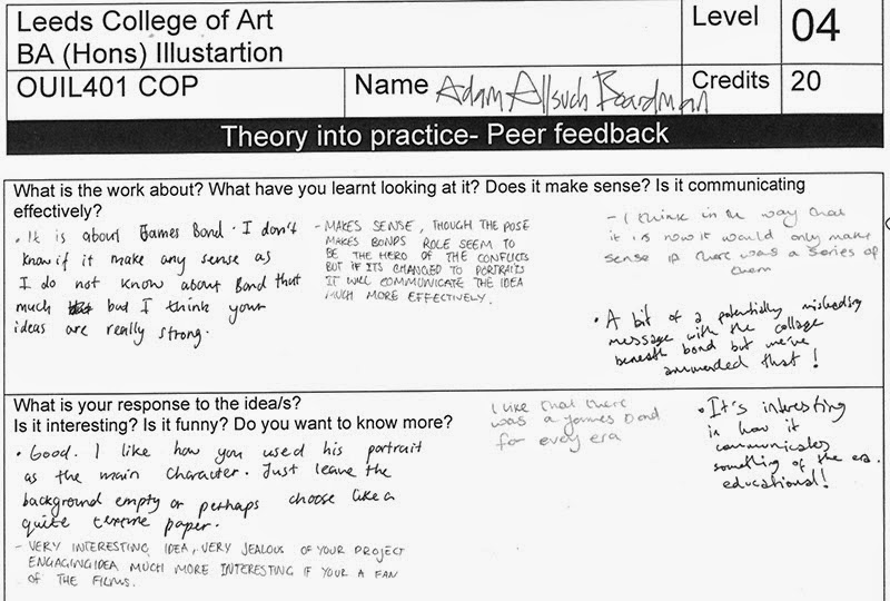
Similarly to the previous crits we grouped rather randomly to avoid familiar faces.
In reflection I found this crit really helpful, perhaps the most successful crit of the whole year. As a group we explored each others qualms and strengths and made decent suggestions.

The group unanimously supported the idea of making a series of posters rather than a single image, as it would help communicate the Bond franchise's legacy.
It was also discussed that the composition should remove the heroic pose of Bond, apparently this created a conflict of message, instead the focal point should be a huge looming face of each Bond.

I have chosen to create compositions for Connery's, Moore's and Craig's Bonds as they are probably the more recognisable of the actors who have portrayed him on screen. They suitably show a broad selection of the last 50 or so years which the franchise has occupied.


Thursday, 24 April 2014

Context of Practice: Posters


After some consideration I resolved to create at least one poster describing the contrast between Bond's jingoistic intentions and the historical and political events of the correlating decades.


As usual I first created several thumbnails based on compositions used in existing Bond posters and related franchises in the Cold War.


I reused my Roger Moore study with an additional upper body pose, typical of the Bond character (he never adopts this pose in the actual films, yet regularly assumes it throughout publicity material). Using this imagery I created three quick palette tests.


Friday, 11 April 2014

Context of Practice: Portraits

Firstly, it was my intention to create portraits which pictured Bond with the most morose


expressions. To find the most appropriate reference material I searched through the seemingly endless stock pile of video montages and tributes of the James Bond character. it was surprisingly difficult to find him showing emotions other than the usual suave-self assured grin.


Sunday, 6 April 2014

Context of Practice: Pecha Kucha

During this session we presented the short presentations that we had prepared over the last few weeks. The presentations delivered the essential premise of our final pieces and explained the research behind them.


I didn't particularly rehearse the presentation, meaning that throughout the delivery I was in a state of mild panic in regards to the short time limit. At least this prevented the presentation becoming non sequitur.

Much to my surprise the feedback was mostly positive, though there was some confusion regarding my actual proposed artwork, which is understandable due to my own confusion in that matter. The only course of action I might undertake is to simply create more visual responses to my body of research.


Wednesday, 26 March 2014

Context of Practice: Studio Brief 2 (Bond the Zeitgeist)

I am not quite content with the visual responses generated thus far. To remedy this I have now re-focussed my attention to the primary point of my essay, that the Bond's franchise can be seen as a distorted fun-house mirror of their respective contemporary cultures.

The Sixties

To elaborate; it is perhaps more interesting to concern with the contextual movements and events disregarded by the franchise, such as the hippie movement, the summer of love etc.

Topically, it was for this reason George Lazenby was disillusioned form the role as 007 and turned up the premiere sporting a rebellious beard. Bond was an icon of the traditional British conservatism, and did not reflect the progressive counter cultures.

http://movies.yahoo.com/blogs/movie-talk/george-lazenby-forgotten-bond-220348935.html
"It was the hippie movement... People were [about] peace, not war. And Bond was about war."
-George Lazenby during a television interview

However, the climax of the hippie movement would soon collapse under a disillusionment fuelled by a sense of futility... To name a few examples; the wide-spread drug cultures, the continuing Vietnam War, the Manson Family and the decay of the Beatles.


The Seventies

This fairly long quote expresses the sentiment with a good analogy:
"Our energy would simply prevail. There was no point in fighting—on our side or theirs. We had all the momentum; we were riding the crest of a high and beautiful wave.…
So now, less than five years later, you can go up on a steep hill in Las Vegas and look West, and with the right kind of eyes you can almost see the high-water mark—that place where the wave finally broke and rolled back."
-THOMPSON, Hunter. S, 2005 [1971], 'Fear and Loathing in Las Vegas', Harper Perennial, London 
The Bond continued to respond directly to popular contemporary cinematic genres, with 'Live and Let Die' reflecting to blaxploitation and Moonraker borrowing from Star Wars. Roger Moores' Bond projected nothing short of self-parody, reflecting a more cynical attitude in western audiences.


The Eighties

In this decade Margret Thatcher proudly announced that 'there is no such thing as society', which galvanised the Left to hate her some more.
Cinematically, the 80s has probably generated more films which have since spawned cult followings than any other decade. Within Britain there were frequent dramatic clashes between the state and the public during events such as the miners strike, marking the end of Britain's role as an industrially-motivated economy.

The Bond franchise suffered during the 80s due to large competition from a large influx of action movies (Die Hard, Lethal Weapon etc), and the self-parodying of Roger Moore's role did not appeal to younger audiences who had become more accustomed to macho archetypes.


The Nineties

This decade saw to the less than smooth dismantlement of the USSR, thus threatening the historical binary opposition that the Bond franchise had thus far relied on to create tension. Suddenly the weight of impending atomic annihilation was subdued and people invented their own preposterous apocalypse to alleviate boredom. The modern technology that we take for granted with really began here, with laptops, mobile telephones and even a poorly timed tablet.

Britain somehow managed to rebrand itself as a 'happening' place with Brit pop and YBAs making a huge global impact.


Friday, 21 March 2014

Context Of Practice: Studio Brief 2 (A Whole New Sketchbook)

 In reflection, I can now see a tangible transformation running throughout this sketchbook. Initially, I found it particularly frustrating, but now as I begin to liberalise my application of line I find that my portraiture has vastly improved.

The first examples begin in a somewhat awkward fashion:


The use of gestural brush in this instance appears to give the image a more humane feeling, rather than the dry linear images of before.


I began to add more additional lines to give the impression of depth and sculpture to faces, this appears to give Bond a more haggard and beaten look.


Though the below example is quite poor in terms of visual accuracy there are several things I can learn from it; half tones can reduce the flatness of linear imagery, and that large-ish portraits don't have to be time consuming.


The top two of the below studies are the closest to what I deem successful, they have a unique aesthetic, born from sketch-book repetition and struggle.


I have long applied this quick methodology to the inanimate, but for some reason I had not made the mental leap to use it on the figure.


I now have the green shoots of an idea concerning the project, I shall continue to use the document in order to document the visual developments.

Saturday, 8 March 2014

Context Of Practice: Studio Brief 2 (Investigative Map)


In order to compress the information into a more visual format I created a 'map of understanding'.
Hopefully, the information therein is self explanatory.
I would have rather worked on a vertical surface, like a wall-mounted board. Perhaps at the next opportunity I shall do as much, because it's reminiscent of those crime boards often seen in thrilling detective dramas.


Thursday, 20 February 2014

Context of Practice: Studio Brief 2 (Initial Research)

The James Bond Film Franchise

5 Quotes:

.'Bond is a projection of the male audiences' aspirational and fantasy of stylish and successful living'
(Spicer, 2003)
.(After feeding the bad guy a shark gun pellet and watching him explode) 'He always did have an inflated opinion of himself.'
(Bond, Live and Let Die, 1973)
.'Bond, James Bond' & 'Vodka Martini, shaken, not stirred' (synonymous phrases associated with the character)
.I might as well ask you if all those vodka martinis ever silence the screams of all the men you've killed... or if you find forgiveness in the arms of all those willing women for all the dead ones you failed to protect. (Alec Trevelyan, Goldeneye, 1995)
.Good, because I think you're a sexist, misogynist dinosaur. A relic of the Cold War... (M, Goldeneye, 1995)

5 Statistics:

.The entire Bond franchise has earned $7,979,000,000 (including merchandise, home video sales etc) It is the most profitable film series in history.
.According to one estimation, Bond consumed 92 units of alcohol per week, which is four times the recommendation
.In Casino Royale Bond consumed 39 units of alcohol before entering a high-speed chase, which resulted in a crash of course.
.Bond has visited about 47 countries
.As a joke, the UK government posted a job position for an SIS 00 agent in November 2012, the annual salary was £50,000 - £60,000.

5 Significant Moments of History:

.Atomic Bomb dropped on Hiroshima on the 5th of August 1945
.Sputnik launched into orbit on the 4th of October 1957
.The Watergate Scandal, June 17th 1972.   
.Star Wars 1977
.Fall of the Soviet Union on the 26th of December 1991


5 People:

.Ian Flemming
.Albert R. Broccoli
.Shirley Bassey
.Sean Connery/George Lazenby/Roger Moore/Timothy Dalton/Pierce Brosnan/Daniel Craig
.Pieter Tazelaar (One of the many supposed individuals Bond was based on)


5 Images:


5 Inventions/Objects/Garments

Walther PPK (Small, for easy concealment)


Lotus Esprit  S1 (Fitted for submarine navigation)


Aston Martin DB5 (With additional machines guns, oil dispenser and passenger ejector seat) 


Tuxedo (Combat armour for the confident)


Jet-pack (For those dramatic roof-top escapes)


5 Locations

SPECTRE Secret Rocket Base (Hidden under a false volcano lake)


Secret Cuban Satellite Dish (Hidden under a false jungle lake)


Graves' Iceland Ice Palace


Drax Industries Space Station


Re-appropriated Abandoned Island (Skyfall)


Stealth Ship


5 Photos/Images/Diagrams (Intriguing Info graphics)

Kill Count


Martinis consumed


Bond Girls


Wednesday, 13 November 2013

Context of Practice: How do we define illustration?

For the following discussion I shall make reference to the following articles by Lawrence Zeegen:
Where is the content? Where is the comment?
Computer Arts (Issue 174) - The Illustration Revival


Tyler Stout - 'Total Recall' poster commissioned by the Alamo Drafthouse Cinema

I define good illustration as a communicative visual device which conveys a concept or meaning to specific recipients. Tyler Stouts illustrations for the Alamo Drafthouse Cinema are intensely well crafted posters promote film events, despite Zeegens allusions that "it's all quantity over quality" it is clear that despite the large catalogue of Stouts posters the intensive quality is not subservient. I would also suggest that these posters evidently "transcend the discipline of graphic art and explore the potential for working with a wider audience." The imagery was initially intended for the advertisement of limited film showings at a cinema chain, they have since become well sought after prints. They have transcended the limited circuit of influence and have become piece of design which manage to compress the narrative information of hours of screen time into a relatively small two dimensional image.

Illustration is primarily used to support or refer to an external medium (such as text) Successful illustration can cause the viewer to experience an emotion, to be informed or provoked. The application of the manipulative illustration will depend on the ethical awareness of an illustrator, this impacts how the piece is valued by peers and recipients, for example a stunning piece of propaganda may have visual merit but simultaneously demonise a class of race. Stout's Total Recall poster includes explicit reference to scenes which occur within the film, in this holistic explosion of narrative it can both intrigue those unfamiliar and inspire nostalgia in existing fans. Zeegen quotes Alex Spiro of Nobrow, "we always try to achieve finished products that are not only filled with great work, but are also art objects, to be coveted, collected and cherished." I would suggest that Stouts work certainly applies to Spiros' criteria, despite being initial reactive and commercial illustration for a specific purpose the works have become commodities which are sought after well beyond their intentional context. This is not a negative thing. Despite Zeegers vague assertions that an illustration such as Stouts might be nothing "much more than contemporary eye candy," I would argue illustration does not have to be weighted with social commentary in order to avoid "the nothingness." Stouts illustrations are not the consummation of the experience, they are connotative reference without being exclusive, an unfamiliar viewer can grasp the general themes an intricacies of the film and may be convinced to go watch it, in which case the poster has succeeded.

A critic might argue that Stouts' posters are simply regurgitating existing information, and lack in personality. I would refute this assertion, Stout has invested a great deal of skill and effort into producing the imagery and despite Zegeers decision that the "allure of the digital" has ceased; Stouts work merges the still evolving digital with screen printing which would  class a part of the "analogue-world." I would like to mention that the analogue world is generally the point of interaction with the majority of illustration, though the time people spend in front of screens is hideously large it is the analogue world that we routinely traipse through .

Tuesday, 5 November 2013

Context of Practice: Semiotic Analysis


Ralph Mcquarrie - [Untitled] Cantina Showdown

Despite the fantastical imagery within this piece of concept art, the presence of relatable cultural codes create a grounding in reality. A large proportion of a western audience will recognise the postures associated with a wild-west showdown. The figure facing us appears slow to reach for his holster and has a relatable human face, this contrasts with the monstrous gangly creature which is showing us it's back and has already whipped out it's blaster. These visual codes relate to the most basic stock characters, a protagonist to which the audience associates and rallies for and an antagonist destined to be thwarted by the virtuous monster slaying hero figure. Though the human hero is not a typically mythical in his stature (he lacks a herculean build) he is causation and wears an outfit reminiscent of a gunslinging cowboy from the old west, which conjures associations with the Hollywood or Spaghetti westerns.

Denotative features are apparent to those unfamiliar with the material. The numerous fantastical figures outnumber the recognisable human figure, we can infer that this is an alien and hostile environment. An armoured figure of authority stands passively as the commotion ensues, we can therefore presume that it is a lawless area and that violence is commonplace. It is connoted that the good characters are those highlighted in colour, and thus by the sunlight, while the villainous lie in a shady dwelling, this is a literal use of the light and dark to visually contrast the conflict between good and evil.
So, despite the initially unusual setting we find that the characters presented are mediated signifiers. The   gunslinging hero and the almost satan-like monster shrouded in darkness are both figures that can be traced back through popular culture.

A simple narrative is present in the image, a pair of characters are situated on the left, this insinuates that they have just arrived 'onstage', the human heroic figure has been surprised by the encounter with the trigger happy alien as his posture denotes, a tension is created by the perpetual showdown, the addressee is invited to imagine the next move. This procedural following of common text insinuates that good will indeed vanquish evil in this circumstance.

There are also numerous signs within the image which communicate characterises based on the addressee's cultural understanding. For example the villain of the piece has the iconicity of a medieval biblical monster, it has a pointed tail like a demon. The hero has a crown of golden hair (a staple of purity and heroic intention, which dates back to Roman association of blonde hair with heroics).

Meanwhile a viewer that is familiar with Star Wars will recognise the setting as the cantina in Mos Eisley Space Port, which is a hive of scum and villainy. The image appears to be early concept art of Han Solo and Greedo's showdown in which Han shoots first thus subverting the heroic nature of the character and creating an anti hero (this feature was later thwarted by digital edits). The indexicality reads thus: the hero Han enters a showdown with a bounty hunter which has been sent to settle various debts to his employer Jabba the Hutt. Though much of this information is inaccessible to an unfamiliar viewer, it is quite elementary even if the character design is not finalised.


Sunday, 13 October 2013

Context of Practice: Image Analysis Exercise.


The Uncle Same Range (1876) Advertising Image by Schumacher & Ettlinger, New York.

Poster by Savile Lumley (1915)

Each design uses text and font quite differently. Firstly, The Uncle Same Range is thick with hidden reference and detail. Much of which is achieved with text that is only legible at a close distance, thus requiring a keen eye to spot, this suggests that the image would have been presented on a large scale in an open public place, rather than a paper which would have limited the use of colour and detail.
There are several typefaces used, which would have been hand drawn rather than printed. The bold text  along the bottom draws the eyes first, proudly proclaiming the product name and company.  The rest of the literature is used in a jovial manner to amuse the viewer, and has been sqeezed chaotically into arrangement by the composition.
In contrast the text in the WW1 poster is much more simple. The white text on black is immediately eye-drawng as the human eye is traditionally used to black text on white backgrounds. The italics suggest a vocal quotation and reads like the subtitles of a film or children's book, which mirrors the book that the supposed daughter is clasping.

The meaning behind The Uncle Same Range is overt, it proclaims the patriotic splendour of it's cooking device, which is barely featured in the image. The composition is a celebration of America's rising dominance a decade on from the declaration of independence, which is conveniently featured on the clock. The image's purpose is to suggest that purchasers of The Uncle Same Range will contribute to America's greatness and conform to the pioneer spirit. The diners featured include the personification of the known world and the old world countries such as England (who have been neglected at the back end of the table), thus suggesting that America with the use of this fantastic kitchen utensil could bring the world to its table, and that a patriotic American would have a grand time knocking up some Thanksgiving dinner on it for the in-laws.

The purpose and meanings behind the recruitment poster are equilly plain. It is directly addressing the conscientious objectors, attempting to goad them into joining the great and glorious war, so that in years to come they can tell their children their splendid and non heinous stories of trench warfare. The subject of the image is a typical middle-class man who has taken no obvious injuries and wears a concerned expression, suggesting that he did not participate in the glory of war. The poster asks the viewer as directly as it does it's fictional Daddy. It questions whether the viewer wishes to become a guilt stricken coward, or perhaps a war hero full of tales of valour for his bountiful offspring.

Each image has been shaped by their contemporary contexts.
The Uncle Same Range exists in a time of a bold America which stands in splendid isolation as the old worlds concerns itself with the Bulgarian atrocities while Britain is preoccupied with Disraelis' and Gladstones' political games. America stands unshaken by its tests of power having separated from The Empire 100 years former and united into the USA just over 10 years previous. America is no longer dependant on foreign developments in the arts, culture and technology. The Centennial Exhibition hosted in the same year boasts a huge amount of technological and artist ingenuity, much as the Great Exhibition of 1851 had done for Britain. This fuelled the demand for all American patriotic products for the American household, the advertisement is striking exactly the right sort of chord.

Meanwhile the later WW1 poster of 1915 pre-dates the use of conscription in Britain, thus it is required to advertise the benefits of attending (or the negatives of not attending) the war. The use of faded browns of soft greens inspire nostalgic imagery of Britain's old glory and perhaps the patterned royal imagery of the rose and crest whisper of a future with new glory forged from the crucible of war.
The boy plays with traditional Redcoats, perhaps reenacting a particularly magnificent battle that viewers of the poster could take part in, if they were to join up. For at this stage in the war the Allies had failed (and would continue to fail) to breakthrough the western front, and the previous year's estimates that the War would 'be over by Christmas' had not come to pass. The situation was perhaps more desperate, however the hangover from last years war glorification remained, hence the poster makes no reference to defending the realm and it is assumed that victory is coming, and soon. 

Context of Practice: Is there a fine art to illustration?

During this post I shall refer to an article by Marshall Arisman which can be found on this link: 


                                                    Stanley Kubrick by David Levine

I affirm that all artists are to some extent interested in making a profit, and that  clean-cut distinctions are inapplicable.
Caricatures are fueled by both the artists' personal absorption with celebraty and the enticement of money. Levines' caricatures were created for the purpose of being bought commercially. In-fact the use of a celebrities' likeness is popularly used as an endorsement.


                                           Richard M. Nixon by David Levine
Above, he is communicating his low opinion of Nixon, he is gorging on grapes with his arm around a bloated pig. The subjective is introduced, the distinction between personally fulfilling and accessible work is blurred. Under the outdated system of dividing 'fine' it simply meets both the criteria.